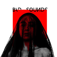

The use of colors in my print productions has been carefully selected to promote different representations and values. The colour palette is simple and basic but effective since it maintains the harmony of a minimalist and neat visual style which is aestheticly pleasant to the eye. These colors have been selected for their clear and distinctive meaning, easy to identify for the audience.They reinforce the sense of duality within ourselves.
The white colour predominates by its representation of purity and all that is good, it has been chosen to paint the background of the cd cover and advert as a methaphor of 'goodness is at your fingertips, it depends on your actions you decide who you are'.Black symbolizes the darkness and the evil and finally, the red color symbolizes the danger and the blood.The meaning that concerns these colors is a perfect tool to promote the main theme that predomines in all my media products: double morality.
In comparison with my music Video, I have chosen a more extensive and neutral color table where the black and white colors used in the villain's makeup stand out, which is a representation of the double morality and the danger that this entails.
The colour black is implied in the fonts of the name of the band 'Bad Sounds' and they were chosen since it reinforces again in the subject of the double morality because some of its letters are turned or hidden.It creates connections between the cd cover .Regarding some specific image or design that is repeated in my products we can find that for the advert to promote the tour of the band 'bad sounds', I used as a guide the design of the front panel of the CD to make it easy for the audience to know that they all belong to the same band.
Between my print productions and my music video there is no specific and clearly visual aspect that is repeated in both but the idea of covering the face is maintained as a representation of danger and oppression in front of the inner struggle between good and evil.The makeup of the villain represents his entrapment and spiritual death, I was strongly influenced by this symbology and decided that I also wanted to cover my face and push this idea in my print productions. The black network is a link, although not visual, quite metaphorical since black means evil and the net means entrapment.The end result is symbolically similar to my music video, hide the identity of the person bringing mystery and fear to the audience.
Although they are very hidden links, each feature of my productions has a link with the music video. The red square that pretends to become blood symbolizes anger and hatred, the confrontation between good and evil and the final catastrophic. All symbolize the consequences of our actions and the danger that this entails.
The brand identity that I wanted to create for the band is a band concerned with transmitting to its audience a message with depth and importance. With a modernized and somewhat tenebrous aesthetic that intelligently uses the image of its media products to make social criticism and teach life lessons.A band concerned with including all kinds of genres and races and which demonstrates empowering the female sex using it as the cover of their cd.
My print productions are closely associated and have very clear aesthetic and duability links to each other, while barely sharing any visual links to the music video, which may be difficult for the audience to identify the music video as a product of the same band. If I had to do this project again I would include some scenes in the music video with the network covering the head to the protagonist and thus to have a cohesive image between all the products.But in general I am very satisfied with the final product and I have managed to transmit visually all the messages and meanings of duability that I wanted.

This is a positive start. T: I'd like you to analyse the significance of the veil - you do mention it, but I think there's more you can say about its symbolism - especially given the cultural climate in Europe. You also need to more time considering the links between your texts - you don't really go into this in much detail and yet it's the focus of the whole question!
ResponderEliminar