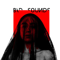
In the realization of my front cover I used as main element a black veil which is the main attention of the scene. The veil has the characteristic that it distorts the appearance of the person who wears it, mysteriously hiding its identity and stimulating the audience with a slight sense of doubt. This prop has undoubtedly the power to represent a dark and gloomy feeling that provokes in the audience the stimulation of mystery and the unexpected. I had as a goal to take this feeling of fear for the moral ambiguity a step forward to create a link between the meaning of the song and the digipack and I used the inside panel of my album using the veil covering two claw-shaped hands directed towards the camera, this acts as direct address and reinforces the feeling of being trapped. Marilyn Manson interestingly recreates this feeling in the audience by using distortion and blurring on the outside of her 'Personal Jesus' album, which are very similar to what I achieved with the 'fishnet' veil.
Following the influence of Marilyn Manson, I wanted my photographs to have high key lighting since a good lighting would facilitate things to me when editing the photo and to be able to modify the shadows and the contrast to obtain a mysterious and dark effect as in the Album cover by the artist. For this I took the photographs in front of a window in broad daylight and with a white wall as background. I also put a pair of lamps pointing to my face to create shadows and definition. The result obtained is similar to the one of Manson has in its front and back cover since there is a very high contrast that drastically differentiates the color white of the black.
 One way to influence the audience in a conclusive and effective way is to use the front cover of your CD to attract the attention of the audience, captivate them and entice them to listen to the album. A feature that I borrowed from Rihanna's latest album 'Anti' is the way she directly addresses the audience by looking at them at the eyes. I used a mid-shot of my face, looking stray into the camera, which allows me to make a connection with the audience and persuade them to take an interest in the album. By using this shot the focus is primarily on my eyes which is one of the key focal point of the album cover. For the other pictures of my print productions I used a High angle shot which gives me the proper perspective to make the audience feel that those hands are directed towards them and therefore reinforce the sense of fear and mystery.
I challenge convetions of psychedelic bands of music since their albums are usually a clear reflection of their music, especially of the hallucinogenic part induced by drugs, The use of bright colors and extravagant designs is usually the norm to follow when it comes to To design an album of a sicodelica rock band.
I in this case I have been influenced more by the content of the lyrics of the song and the story that it transmits more than by the style of music of the band. It message is clear and concise, the inner stuggle of a moral struggle between evil and good. This may be a problem because when you see the album does not give you the impression that it is a band of psychedelic music since the art used in the album is very contemporary and minimalist. And although my print productions doensn't explicity portray Narrative there are strong links that have been created to the thematic narrative in the song and music video. From all ofas I decided that instead of explicity adressing to the physical conflict between the characters in the music video, I would portray duality through editing techniques, color, design ad layout.
For example the high contrast between black and white colors is an essential metaphor for the audience to unravel the meanings hidden in the colors that refer to the history of music video in the struggle between good and evil. I adress the conflict with the editing technique used to make it red cube in the background melt as it is bleeding, this technique adds damatisco fear and mystery to the plot and aesthetics of the CD. The same use of colors is identically portrayed throughout my print productions which builds a strong link between them and the music video.